Branding & Visual Design
Your brand is more than a logo, it's the heart of how your audience connects with you. Brand Design is a deeply strategic and creative service where we shape the visual identity, tone, and presence of your business.

.png)
When I started on the Aero Atlas project, it was a tool for plane spotters. These aviation fans used it to track takeoffs and landings. They documented tail numbers. But my research showed something else.
Travelers were our most valuable users. They were not enthusiasts. They were the ones who generated most of the money. I talked to these travelers. The data was right. They did not just want to track flights. They wanted to manage their entire trip. They needed a smarter tool.
My new goal was clear. I would change Aero Atlas. It would go from a simple flight tracker to an active travel assistant. I was the only designer. I led the full redesign. I rebuilt the saved flight card. I simplified the navigation. I made the flight details page a hub for real-time help.
This is the story of how I rebuilt the app. I focused on the people who needed it the most.
Redesigning Aero Atlas wasn’t just about swapping features. It meant asking the right questions:

.png)
.png)
I had a core design challenge. I needed to balance two user groups with very different needs. I also had to prioritize the group that drove growth.I made every decision with intention. It had to be lightweight. It had to be rooted in real-world use.
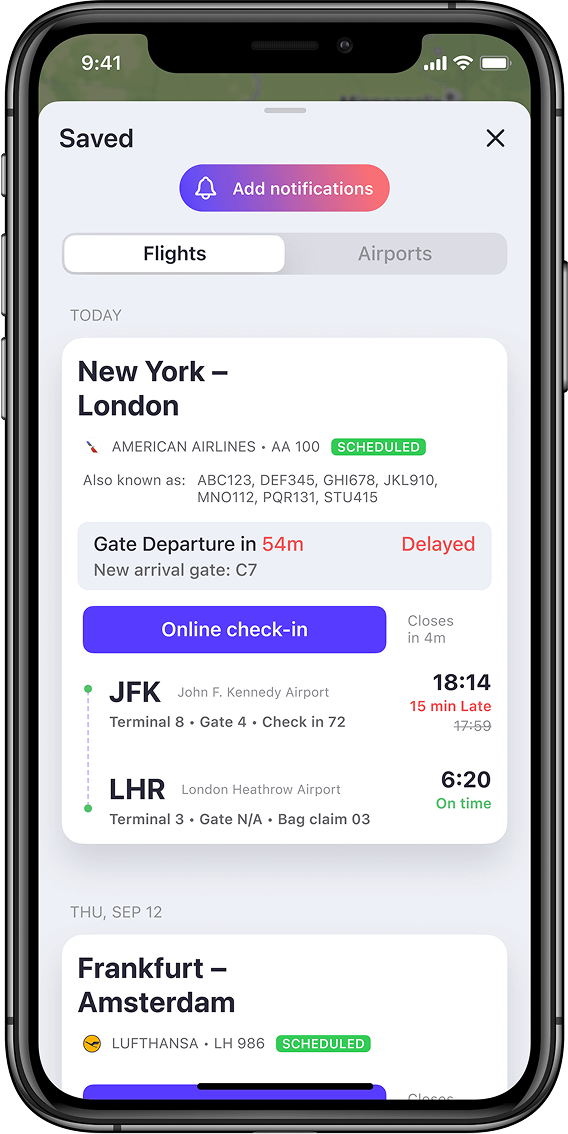
Travel is rarely smooth. You might be at the airport, everything on track, then suddenly, your gate changes. You’re rushing, juggling luggage, trying to find updated info on your phone.
The old flight card didn’t help in moments like this. It showed too much static data, not enough of what actually mattered right then. I redesigned it as an Adaptive Flight View, a responsive module that adjusts based on where you are in your journey.
It highlights gate info, boarding time, and terminal.
It shifts focus to delays, arrival updates, and in-air progress.
It highlights gate info, boarding time, and terminal.
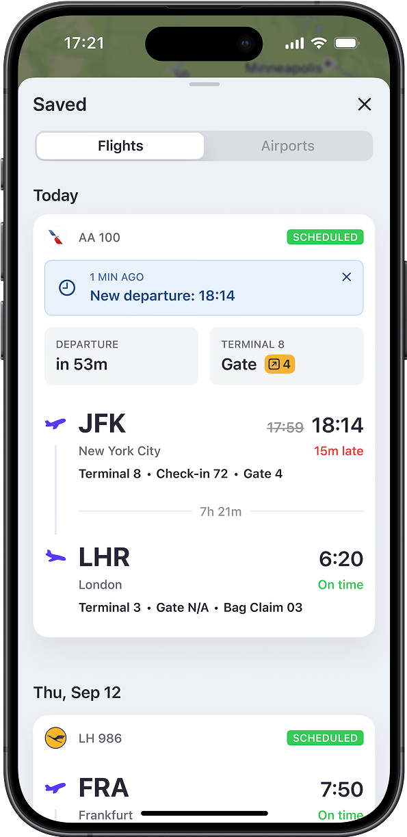

Quick Note: The flight number on your boarding pass might not match the one shown on the Departures board. This happens with codeshare flights.
The new Adaptive Flight View handles this seamlessly. It shows both the number you added and the actual operating flight number, so there’s no confusion between what’s on your pass and what’s on the screen at the airport.


As a bonus, the new system also detects “travel hack” flights:Self-transfers, overnight layovers, or disconnected bookings that form a single journey.
It connects the dots and treats them as one trip, so you don’t have to.
Originally, every page opened as a modal layered over the main map. It felt stacked, cluttered, and hard to navigate when switching between flights, saved data, or settings.

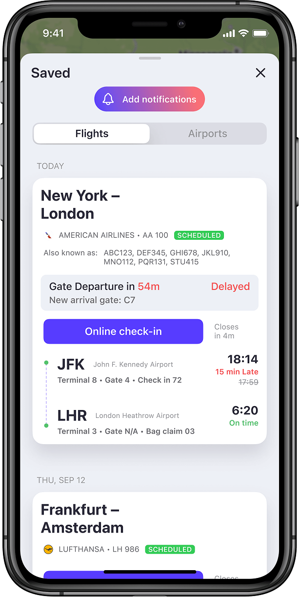
Travelers didn’t need a live map full of flights in the sky.They needed quick access to their saved flights without digging through layers.
To fix this, I redesigned the navigation to support full-screen pages.Now, travelers can set the Saved page as their default view, making it faster to check flight updates and harder to accidentally close it in a hurry.
I also merged the map and search into a single Explore page.The search field now lives directly on the map which works well for travelers and still serves plane spotters, who rely on the map and search the most.Travelers didn’t need a live map full of flights in the sky.They needed quick access to their saved flights without digging through layers.


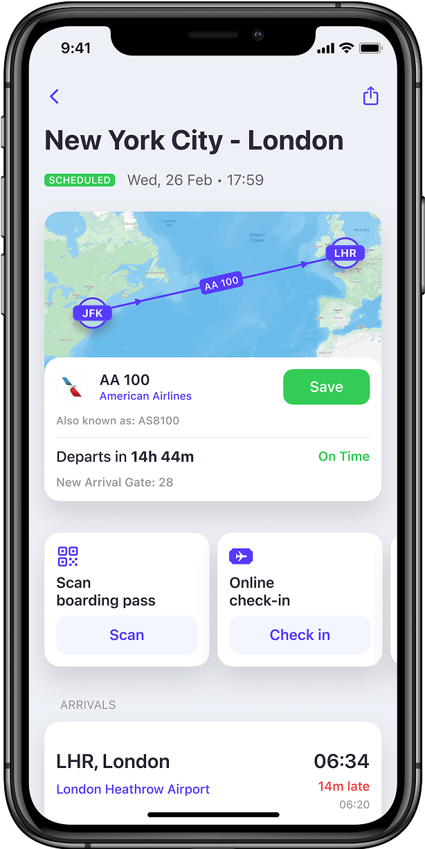
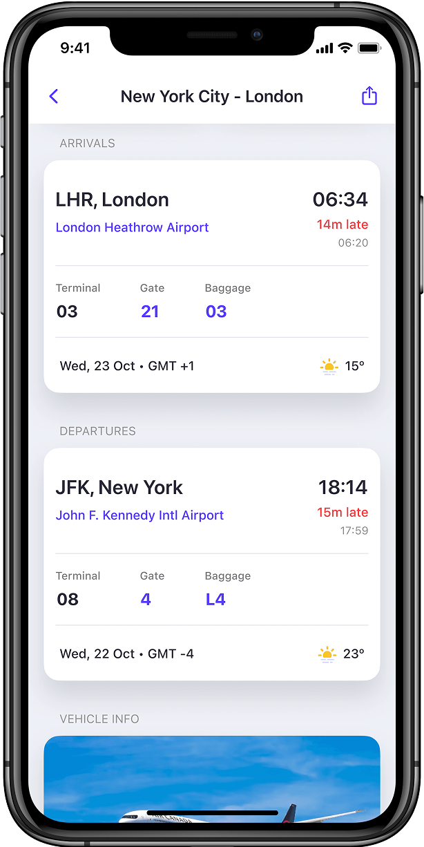
At this stage, we were rolling out changes gradually to ease the transition for existing users.But one key screen was still untouched. The Flight Details page that opens when you tap on a flight card. It was trying to serve both travelers and plane spotters, and ended up serving neither well.
To fix that, I redesigned and reorganized the entire layout with a clear focus on travelers. Here’s what changed:

.png)
.png)
.png)
.png)
.png)
.png)
With the redesign I've tried to add value with each section.
For example, the security wait time widget shows both current wait times and the ones 3h prior to departure, when you'll probably arrive at the airport.
The map opens your departure terminal and level by default.

Aero Atlas is now a travel assistant. I redesigned the saved flight view, introduced a more practical navigation flow, and restructured the flight details page around what travelers actually need.
I led this shift by rethinking the core touch-points: designing a smarter, adaptive flight view, replacing the outdated navigation with a structure that works better on the move, and rebuilding the flight details page from the ground up with travelers in mind.
More than just numbers, the work created a foundation for a more intuitive and supportive travel experience, with plenty of room to grow.

There’s huge potential in personalizing travel experiences, especially given how complex and hectic they can be. Some areas still need attention, like booking airport taxis or managing long-term parking.
The journey doesn’t end when the plane lands. Looking back, I would break the flight details page redesign into smaller, incremental updates.
This approach would help gain stakeholder buy-in more easily and give us space to carefully design each change. It ensures every update delivers real value and adapts to different travel scenarios.
Your brand is more than a logo, it's the heart of how your audience connects with you. Brand Design is a deeply strategic and creative service where we shape the visual identity, tone, and presence of your business.
.png)
We combine creativity with usability to design intuitive, engaging, and impactful digital experiences. Whether you're building a mobile app, website, or digital platform, we ensure every interaction feels natural and every journey is meaningful.
We build high-performing websites that look stunning and work seamlessly across devices. Specializing in Webflow and Framer, we combine visual impact with technical precision to deliver sites that are fast, secure, and easy to maintain.
From concept to launch, we create scalable mobile and web applications that deliver smooth, intuitive, and reliable user experiences. Whether it’s a consumer-facing app or an enterprise-grade platform, we merge great design with robust engineering.
We work as an extension of your product team to bring clarity, precision, and speed to your design efforts. We focus on diagnosing challenges, setting a clear design direction, and enabling your team to deliver consistently high-quality experiences. Whether you’re scaling a product, introducing a new feature, or refining an entire system, we help you move from uncertainty to confident decision-making.

.svg)